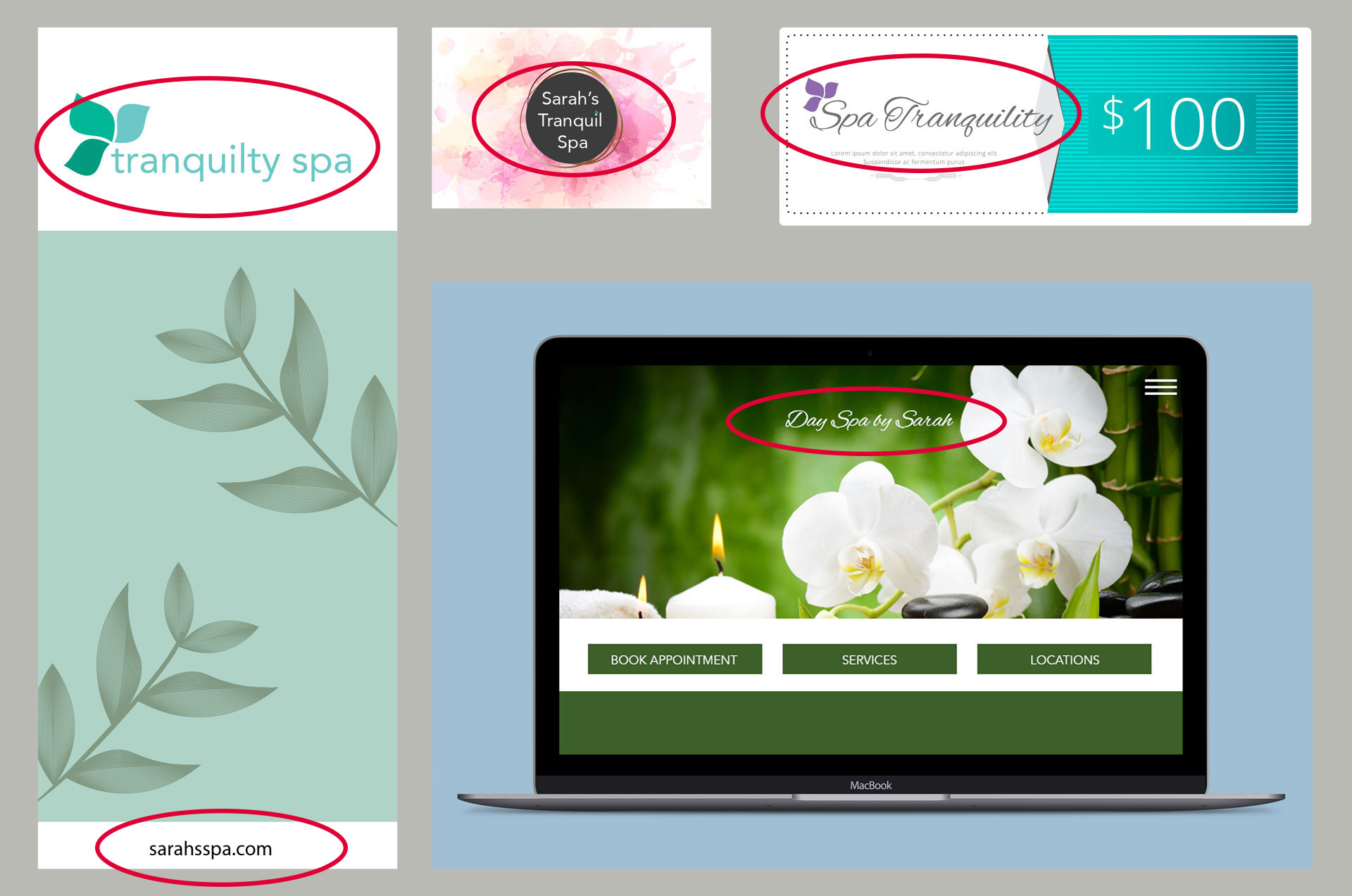


Brand Inconsistency Causes Confusion
Brand consistency takes you beyond the hard sell and provides a perception of quality and professionalism that adds to your brand equity immeasurably. While the old adage is “Don’t judge a book by its cover,” the reality is that we all do just that — starting with our first look at a brand.
Let’s say you receive a gift certificate for a massage. The certificate has a logo on it. You go to the website hoping to find more details about their services so you can book the massage you want. The website has a second logo on it — are you in the right place? You decide to call and see; it is the right place, so you book. When you arrive for your appointment, the sign in front has still another logo, and your massage therapist is wearing a shirt with a completely different logo and different colors on it. Had you not received the gift certificate, would you have chosen to visit this business? Or would all of the inconsistencies have subtly undermined your confidence in this place’s professionalism and quality?
That’s the power of a brand — and the importance of consistency.

Brand Development by McD for the Center for the Prevention of Abuse
And that’s why when we create brands, or refresh brands for clients, it’s not a one-step setup. Our account managers research customer perception, the competition, industry trends and other factors. Our designers research style and imagery usage in the market and examine purchaser preferences through the lens of contemporary brand trajectories. Our writers develop the voice for the brand including the brand promise statement so that customer experience and expectations align with the actual brand elements and promotional strategy.
“A good brand will translate across all platforms. Lack of consistency causes confusion. Cohesion in branding creates confidence.”
– Kaitlin Hamilton, Creative Director
So how do you ensure that your brand stays strong and effective for all different media? Start by staying true to your organization. Just because you like a certain style of a consumer ad campaign, doesn’t mean it will translate your brand attributes. Choose a brand architecture that will accurately portray your brand equity and portray the image that want to convey long term… not something that only appeals to your personal preferences.
Then, aim for timeless. The strongest brands shouldn’t need an overhaul, and even refreshes with small color and font tweaks should be rare. How do you know it’s time? If your brand looks dated in the context of your target segments, or if you haven’t spoken with a marketing strategist, internal or external, in years, it may be time for a reassessment.

Note the Inconsistent Names and Logos
Targeting timeless branding also means carefully balancing trends. The popularity of too-trendy fonts like handwriting or scripts come and go quickly. More classic serif and sans serif fonts will stand the test of time. Of course we aren’t saying there isn’t a place and a market for trendy fonts; we’re simply cautioning that a little research and study will best reveal when that may be.
